In 2022, I was part of a series of talks on accessibility open to all of Wunderman Thompson from the Costa Rica office. This talk centered around how we can create accessible web experiences by intentionally designing with all senses and input methods in mind.
Introduction
In this series of talks, we will be hearing about accessibility from the point of view of different disciplines. We already heard about research during the previous session with Cata and Ignacio. Today we are focusing, broadly, on user experience. My goal is to give you some thinking tools to shift your mindset from designing primarily visual experiences to taking a technology agnostic approach to how we deliver functionality and content.
What does this mean?
I’ll be sharing strategies we can use while designing to break the screen paradigm. I’ve observed that some designers are very quick to jump into the design software of their choice and start defining interface elements, which automatically leaves out people interacting with our products through input and output technologies other than a screen. We’ll be talking about different input and output technologies and how to make sure our work is ready for them.
For the purposes of this session, I want to place us within specific parameters in terms of where we are in the lifecycle of a project and the maturity of accessibility in our practice.
First, I’m assuming we are past the stage of convincing stakeholders. We already know accessibility is important and we are committed to designing and developing accessible experiences. I found this quote when I was doing research for this session, and I really like the direct approach. It says:
The biggest misconception about accessibility is that by adding it you’re doing someone a favor. You’re not, you’re doing your job.
James Williamson, Senior Author at Lynda
Tweet from Oct 20, 2016
This is the mindset I’d like to take in my own work. Accessibility is not something you add, it’s a trait of the website. Full stop.
Second, I’m proposing these tools as ideation and definition tools. Artifacts created during the design process typically serve four main purposes: exploration of ideas, definition of details, communication with stakeholders and documentation for implementation. I think we can use these exercises to explore inclusive ways of designing and to carve out the details of the final product. I would love to explore how to document accessibility in the future, since we don’t have enough time to address this today.
Where do we start?
Alright, so where do we start?
What is a website?
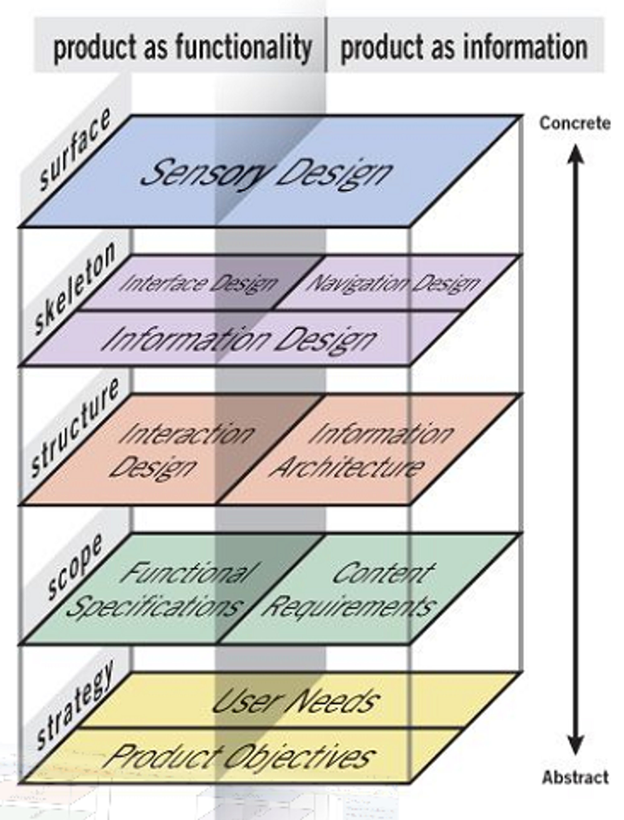
This might seem like a basic place to start, but I think it’s worth covering. A website is mainly a way to deliver functionality, deliver information, or both. The first two planes, from the bottom up, are our foundation. This foundation doesn’t care about the form factor we are going to use yet. It only cares about needs and goals. The three planes at the top take us to a higher level of fidelity. Note that the top-most plane doesn’t say “visual design”, it says “sensory design”.
I think this framework is helpful because it allows us to focus on what our design goals should be. We should provide a way for people to perceive, understand, navigate, and interact with our website, and this should be the case regardless of the technology they are using to access it.
People using screen readers or keyboard navigation are not an audience segment. We can’t draw a line around a group of people with certain access needs and call them an audience segment. Users come to a website with a variety of goals that are independent of the input and output methods they use.
Accessibility Matrix
Now, let’s talk about input and output methods.
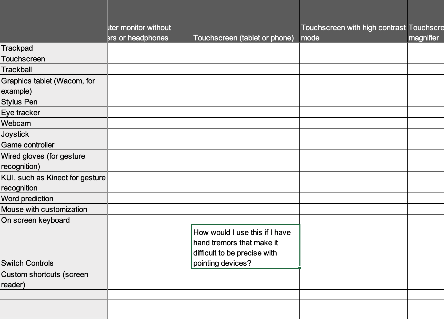
The book Accessibility for Everyone, introduced me to the concept of a testing matrix applied to accessibility. Those of you working in QA might be familiar with it already. The idea is that you use the matrix to identify pairing for input and output and test your website with those pairing. Here’s an example:

Now, I think we don’t need to wait until QA to take advantage of this tool. We could integrate an accessibility matrix to direct us as we think through our designs. That way we can have a broader notion of how our website is going to be used.
The first thing I want to do is expand our matrix from input and output devices to include all assistive technologies, software and hardware, and adaptive strategies, like zoom, captions and increasing text size.
It’s probably not possible to cover every single combination, but we want to cover as many senses as possible: Vision, hearing and touch.
The resulting matrix looks like this:

Is it complete? Probably not. But it’s a start.
How would I use this if…?
Ok, how do we use this?
One way is to create scenarios for role play as we design. We can ask questions like:
- How would I use this if I can’t see the screen?
- How would I use this if I have hand tremors that make it difficult to be precise with pointing devices?
- How would I use this if I have trouble focusing on the screen for long periods of time?
- How would I use this if I had red and green color blindness?
Through role play and prototyping, you can simulate traits such as focus order, actions that require high precision, blinking or fast moving animations and slow connection situations.
Let’s take the question “How would I use this if I have hand tremors that make it difficult to be precise with pointing devices?” If I’m using a phone, one way I could do it would be switch controls. We have this intersection here:
Let’s take this and act out how I would interact with a simple e-commerce website:
You see we are not building yet, but we are designing in a way that accounts for how people will access our website. It keeps us from pretending a mouse-keyboard-monitor combination is the only way our design will be experienced.
If we want to enrich our stories, we could also use Cards for Humanity to get ideas of possible situations. The section Stories of Web Users in the w3.org website also provides great insights on how people use the web across a diversity of abilities.
Defining Structure Before Presentation
There’s one last thing I want to cover.
If you’ve spent any amount of time reading about accessibility online, you’ve likely seen mentions of semantic HTML and ARIA. I’m not qualified to talk about these topics, that’s what the following talks are for. But I do want to encourage all of you to learn about some basic concepts.
I’m going to quickly explain a couple of them that I think are particularly useful to consider during the early stages of a project. I’m sure it will be an oversimplification. I apologize in advance to the developers in the audience.
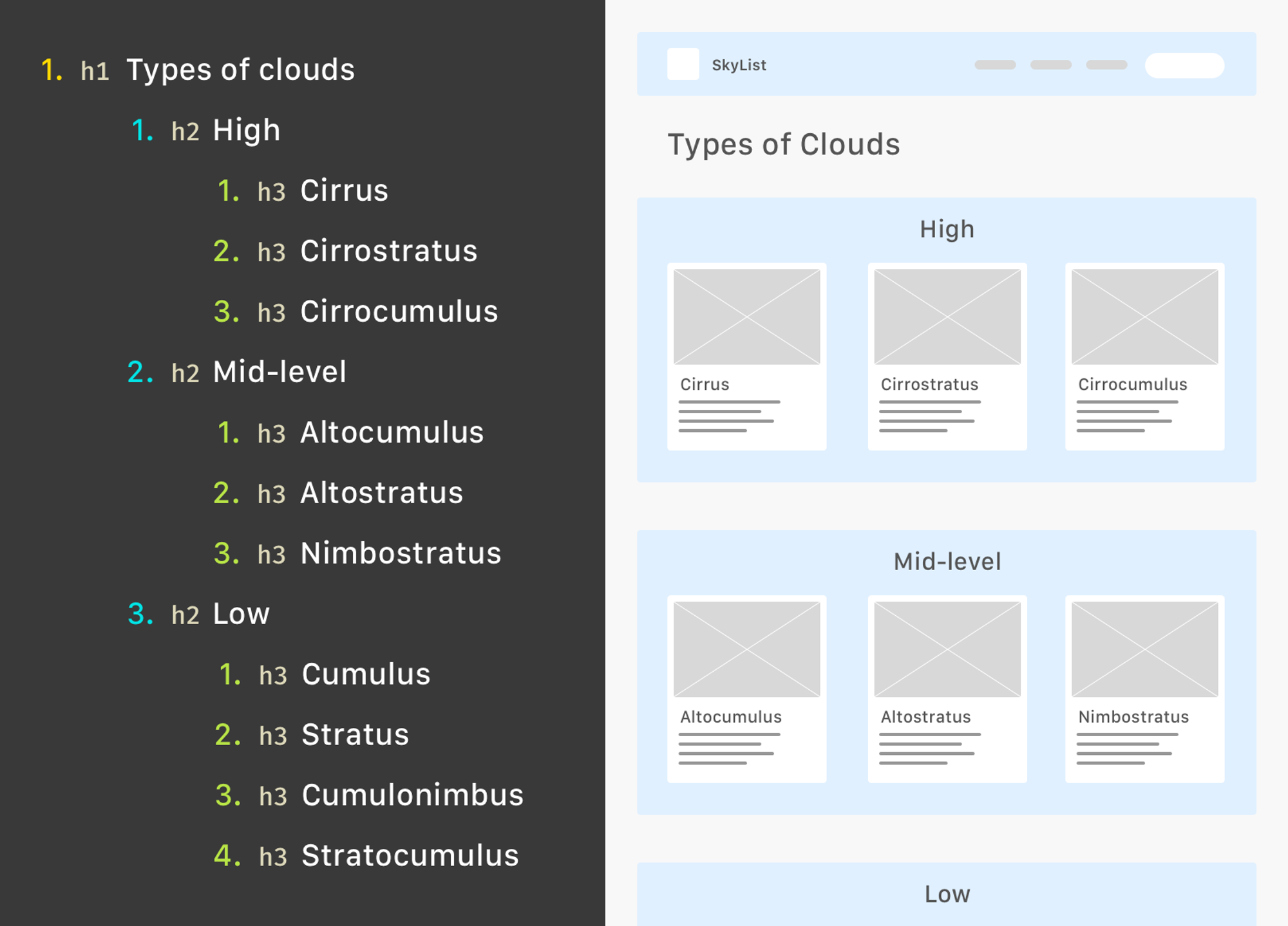
The first one is headings.
Heading are important because they provide an outline of a page’s content. Their hierarchy is not based on the font size you use to represent them. That’s why the WCAG and any other set of guidelines we can find, recommend that we don’t skip heading level or omit the H1. A good headings structure is useful to all users, not just users looking at a screen.
The second one is landmarks.
A quick story time. I took an extremely basic “web development” course in 2009. The instructor gave us timeless lessons, like “use HTML tables to structure your content”, and “you can add your titles as images if you want to use a nicer font”. It’s possible this information was outdated, even at the time. I say this to point out that we’ve come a long way.
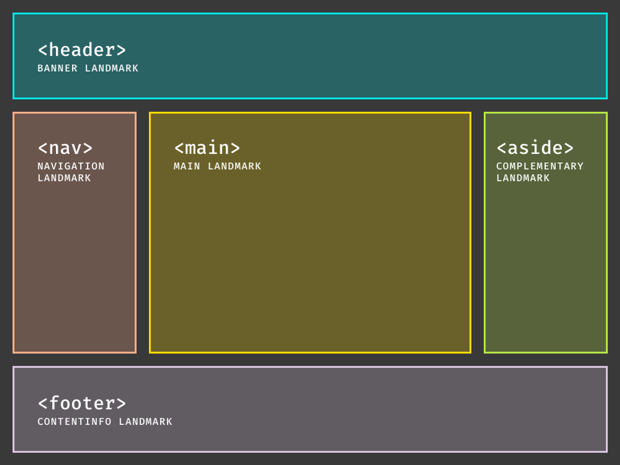
Landmarks are roles described by HTML sectioning elements. Screen readers are able to see all landmarks available in a page, allowing users to navigate to the one they want. This is very powerful because it translates the visual experience of skimming through a page.
What I want you to take away is this:
Before you start designing specific interface elements, make a logical outline for it. Think about headings and landmarks. Think about how someone would navigate through it, without relying on graphical interface elements. This way you establish intent and carry it to the different ways your content or functionality will be delivered.
Conclusion
An accessible website is one that doesn’t impose restrictions on users because they are using technology other than a keyboard, mouse and monitor, or because they perceive the world in a way that differs from the “norm”. And I use quotes around “norm” because the norm is imaginary. We simply cannot assume that our users will access our websites in a certain way and will perceive it the way we want them to. We need to plan for user control and accept that the end result is not ours.
If you try any of this in your work, let me know. I’m just starting to apply it myself, and I’m excited to see how we grow our accessible design practices.

You must be logged in to post a comment.